
JOURNAL
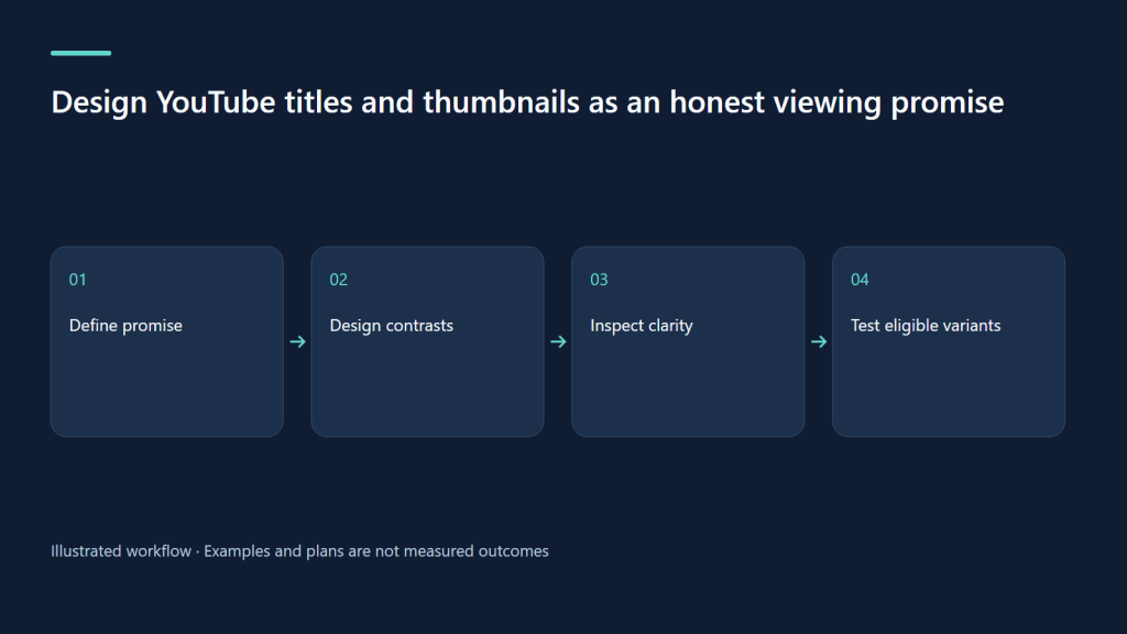
Design YouTube titles and thumbnails as an honest viewing promise
Create complementary title and thumbnail concepts, inspect small-screen clarity and plan eligible native experiments.
On this page
The title and thumbnail are a small promise about a much larger viewing experience. They should help the right person recognize the topic, anticipate the result and understand why the lesson is worth opening. A package can look attractive yet fail at that job if it hides the actual task. This workflow uses an adult editing tutorial as an example: correcting a voice recording that is difficult to hear over background music.
Describe the result before choosing the visual style
Write a sentence that could be verified by watching the video: “The tutorial demonstrates how to lower music under a spoken passage without losing the music entirely.” Avoid claims such as perfect sound in one click unless the footage supports that exact promise and its conditions. Then identify the viewer’s likely context. A beginner searching for quiet speech needs clear task wording; a Browse viewer may first need to see the contrast between an obscured voice and a balanced mix.
The title can carry the task while the thumbnail carries evidence. “Make Voiceovers Clearer Over Background Music” pairs with a simple waveform comparison and the words “Voice / Music.” Putting the full title again inside the image wastes space and makes the picture hard to read. A close view of the relevant control can be useful, but a screenshot containing every panel, tiny numbers and three arrows is not automatically more informative.
Create distinct concepts, not cosmetic variations
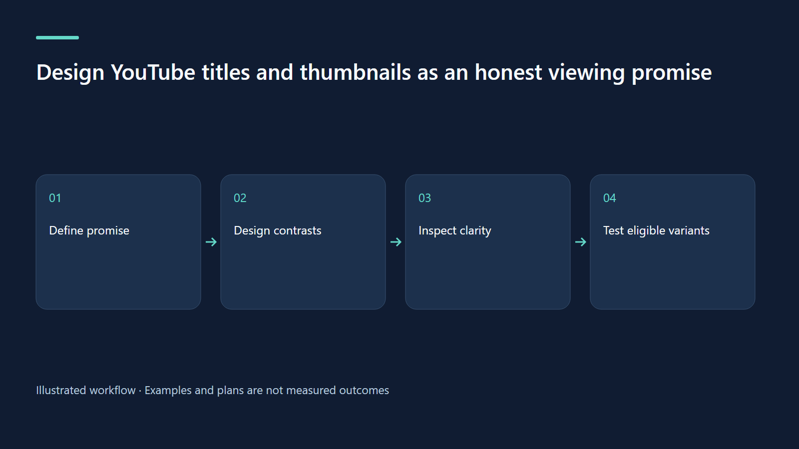
Sketch three concepts before opening the design tool. One might emphasize the audible problem, one the visible adjustment and one the before-and-after result. Keep the underlying lesson accurate in each. Changing only the border color often tells you little about the editorial question. A meaningful contrast could compare a recognizable demonstration frame with a simplified diagram, provided both genuinely represent the video.
| Concept | Title direction | Thumbnail direction | Risk to inspect |
|---|---|---|---|
| Task | Clear voice over music | Two labeled audio layers | Too generic to identify the method |
| Demonstration | Balance speech and a music bed | Actual mixer adjustment | Interface text too small |
| Contrast | Why your narration gets buried | Before-and-after level balance | Suggesting an outcome not shown |
Compare the concepts against the opening of the actual video. If the image promises an immediate audio comparison, the opening should deliver it promptly. If the title names one application, the demonstration should not spend most of its time in another. Packaging and editing need the same brief. Otherwise a successful click can become an avoidable expectation mismatch, which is a production problem rather than a typography problem.
Inspect at the size people actually encounter
Export rough versions and view them small, without zooming. Ask a colleague what the lesson appears to teach before you explain it. Their first description is useful evidence about clarity, though it is not a substitute for audience analytics. Check contrast, crop safety, the recognizability of the main object and whether a face expression suggests a drama absent from the footage. Remove decorative items that compete with the instructional point.
For bilingual material, do not assume that two full sentences belong on one image. Choose the language of the intended viewing experience and keep supporting translations in suitable metadata or companion resources. If a software command is English in the footage, retaining that label may be helpful, but the surrounding explanation should fit the audience. Test whether the picture still communicates when its short text is read slowly or on a small phone.
Check native testing eligibility before planning a test
YouTube’s current A/B testing documentation covers up to three title, image or combined variants. Desktop and advanced features are required; Shorts, made-for-kids, private and mature-audience content are excluded. Check eligibility before allocating design work.
For an eligible adult tutorial, define the question before starting: “Does a task-led or demonstration-led package better communicate this existing lesson?” If you vary both title and image, describe the result as a package result; you cannot isolate the contribution of either element. The native tool evaluates watch-time outcomes, so a version that attracts clicks but loses viewers quickly is not automatically the stronger choice. Treat an inconclusive outcome as insufficient evidence rather than a failed channel.
Keep observations and causal claims separate
A manual change on Monday followed by more views on Tuesday is an observation. It is not a controlled experiment: exposure, audience familiarity, topic interest and external sharing can also change. Save the old package, date the revision and record those possible influences. Use the comparison to form a next question, not to announce that a certain font or title length caused a percentage lift. Hypothetical numbers in a planning sheet should be labeled as such.
Do not chase a universal CTR threshold. Interpret available impression and viewing metrics within the source, format, audience and period you are reviewing. Search and Browse may involve different viewer expectations, while Shorts requires a different opening analysis. A title that is excellent for one precise query may be less understandable when shown without that query. The practical objective is a truthful, legible promise supported by the video.
Exercise: run a packaging review before publication
Write the verified promise, sketch three distinct concepts and select the one whose image and words work together. Inspect the small export, then replay the first minute and mark where the promise is fulfilled. Record one risk, one eligibility check and the evidence you will inspect later. If native testing is unavailable, retain the concepts as editorial alternatives and keep any manual revision clearly labeled as observational. This creates a reusable design decision without promising ranking, clicks or income.
Related learning paths
Related reading
08 Oct 2026 · 6 min read
YouTube SEO
Be Vui Hoc: a proposed bilingual discovery and learning plan
A clearly labeled planning case for a children’s learning channel, with audience constraints, lesson briefs and a future measurement sheet.
Read more
08 Oct 2026 · 5 min read
YouTube SEO
YouTube SEO: separate Search, Browse, Suggested and Shorts
Build a practical discovery diagnosis around viewer intent, traffic sources and the promise your video actually delivers.
Read more
08 Oct 2026 · 5 min read
YouTube SEO
Build a YouTube keyword and topic map that improves the lesson
Turn audience questions into a manageable video library with intent clusters, language decisions and production-ready briefs.
Read more
Discussion
Comments are reviewed before publication. Your email is kept private.